Tabs
Tabs are used to organize related content. They allow the user to navigate between groups of information that appear within the same context.
Overview
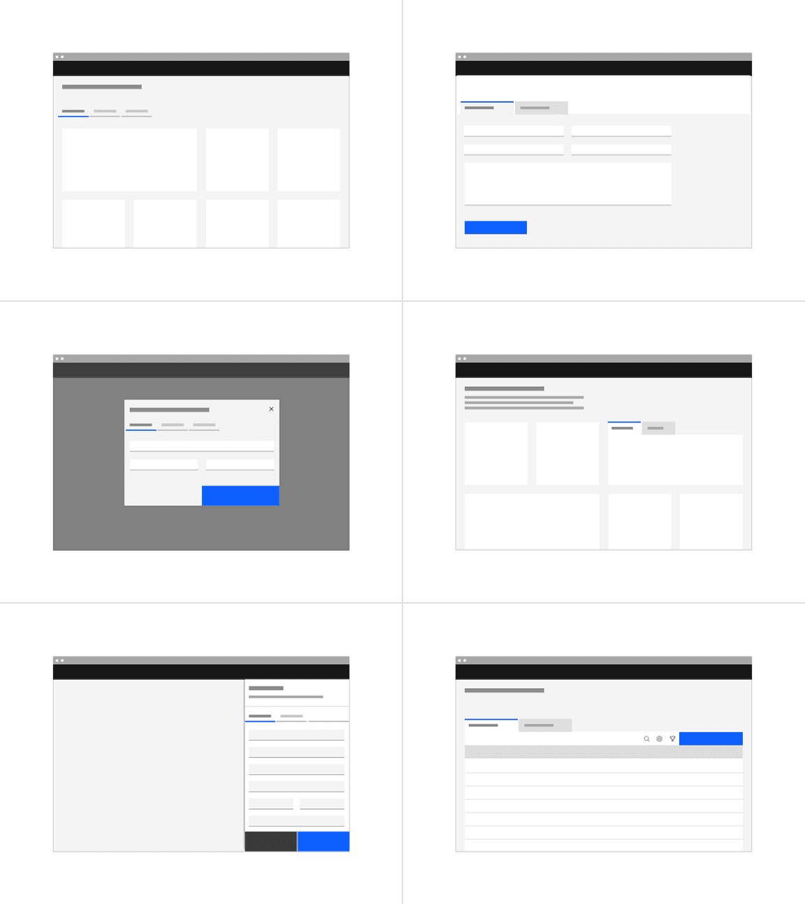
Tabs are used to group different but related content, allowing users to navigate views without leaving the page. They always contain at least two items and one tab is active at a time. Tabs can be used on full page layouts or in components such as modals, cards, or side panels.
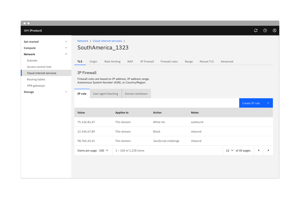
When to use
- Use tabs to group related information into different categories, helping to reduce cognitive load.
- Tabs can be used to organize content such as forms, settings, and dashboards so a user does not have to navigate away from their workflow to complete their task.
When not to use
- Tabs should never be used for primary navigation. If tabs become too complex, consider using a standard navigation pattern.
- Tabs should not be used to indicate progress. Use the progress indicator instead.
- Tabs should not be used if the user is comparing information in two groups, as this would result in the user having to click back and forth to complete a task.
Variants
| Variant | Purpose |
|---|---|
| Line | A standalone tab that can also be nested within components. It is commonly used within components or for content using the entire page for layout, not connected to any other components. |
| Contained | An emphasized tab that is always attached to a background container. It is commonly used for defined content areas, like sub-pages or attached to cards. |
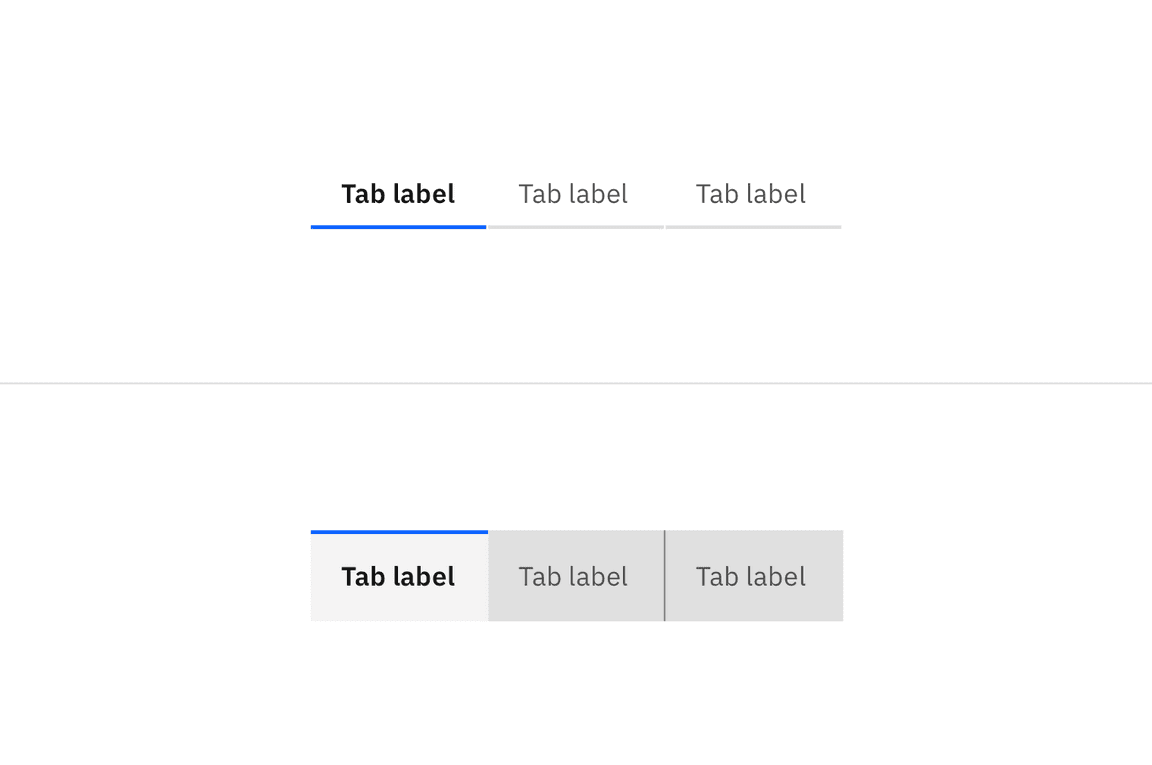
Examples of line tabs (top) and contained tabs (bottom)
Live demo
<div style={{ width: '75%' }}><Tabs><TabList aria-label="List of tabs"><Tab>Tab Label 1</Tab><Tab>Tab Label 2</Tab><Tab disabled>Tab Label 3</Tab><Tab>Tab Label 4 with a very long long title</Tab><Tab>Tab Label 5</Tab></TabList><TabPanels><TabPanel>Tab Panel 1</TabPanel><TabPanel>Tab Panel 2 <Button>Example button</Button></TabPanel><TabPanel>Tab Panel 3</TabPanel><TabPanel>Tab Panel 4</TabPanel><TabPanel>Tab Panel 5</TabPanel></TabPanels></Tabs></div>
Formatting
The tab component consists of two distinct zones: selected and unselected. There are always at least two tabs and one is selected by default. Icons are optional.
Anatomy of line tabs
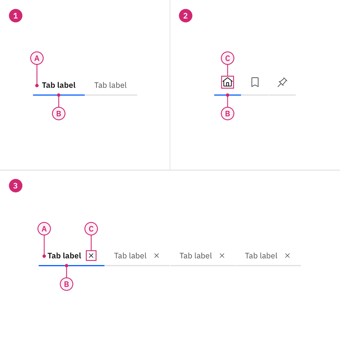
1. Line tabs
A. Label
B. Indicator
3. Line tabs with icon
A. Label
B. Indicator
C. Icon
2. Icon-only line tabs
B. Indicator
C. Icon
Anatomy of contained tabs
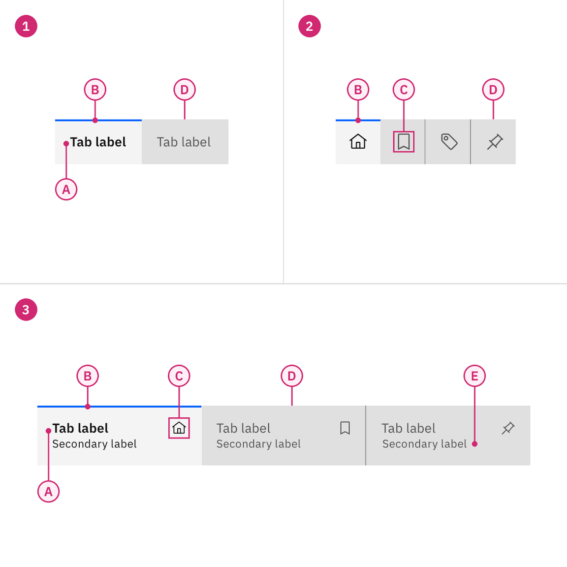
1. Contained tabs
A. Label
B. Indicator
D. Container
3. Contained tabs with icon and secondary label
A. Label
B. Indicator
C. Icon (optional)
D. Container
E. Secondary label (optional)
2. Contained tab with icons only
B. Indicator
C. Icon
D. Container
Alignment
Much like buttons, alignment of tabs depends on where they appear and whether or not they’re contained within another component. As a general rule, the first label for both line tabs and contained tabs align with the grid and the text below. If tabs are within another component, such as a card, follow the grid that you are using inside the component and align the label with text in the component.
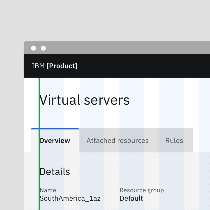
Do align tab labels with the grid
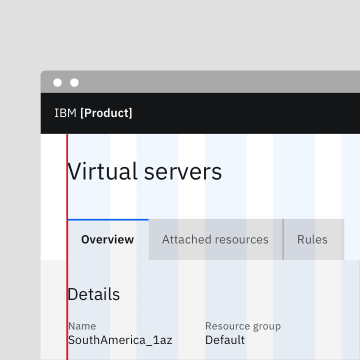
Do not align tab container with the grid
Auto-width
With both line tabs and contained tabs, auto-width is the default behavior. Each tab will be a different size depending on the label’s character count but will have consistent padding on each side of the label. The first label, selected by default, should align to the grid. Where the tabs end will vary and may not end on the grid. If needed, you may also use a line to help balance tabs with other components on the page.
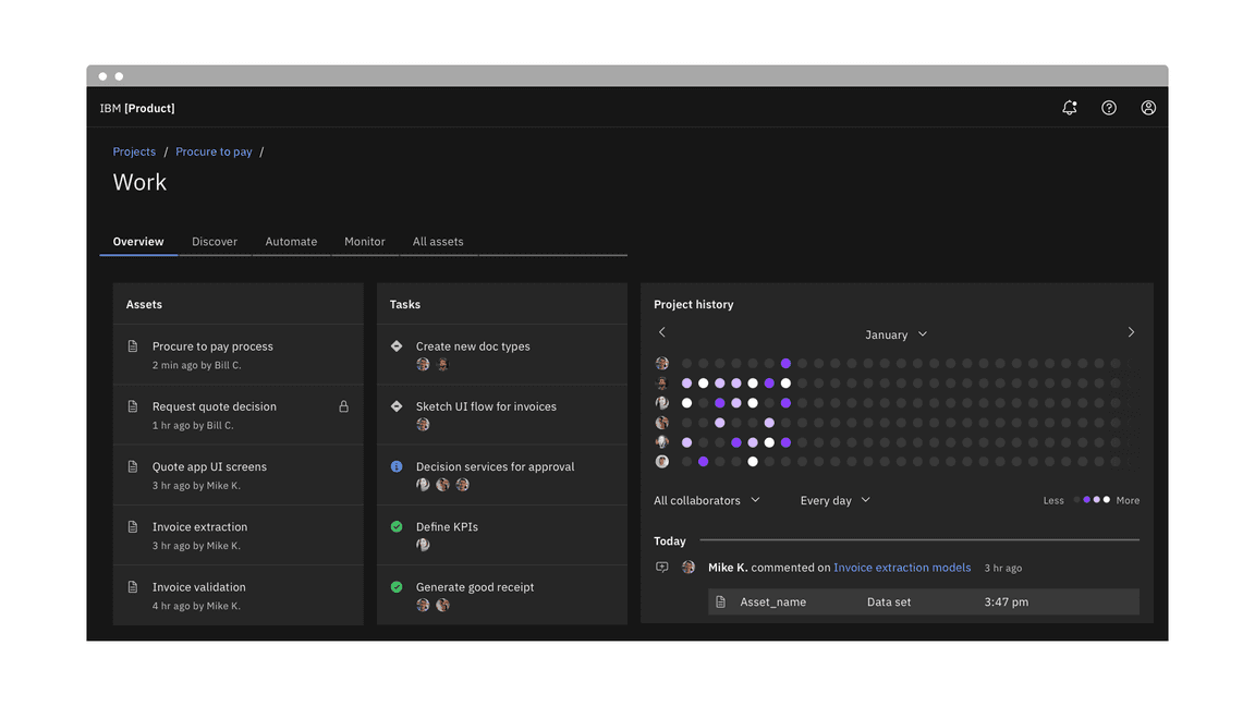
Example of auto-width line tabs using a rule
Aligning to grid columns
Instead of using the default auto-width behavior, contained tabs also have the option to align to the grid. As a group, the tabs span a set of columns with each tab being equal in size. The first tab’s label should align to the first column you are using with the last tab in the group always ending at a column’s edge. The tabs in between will flow accordingly and may or may not align to the grid but will always be the same size.
Use the 2x grid to drive visual rhythm by spacing content in multiples of two columns and aligning the beginning and ending of the tab elements with content below the tabs when possible.
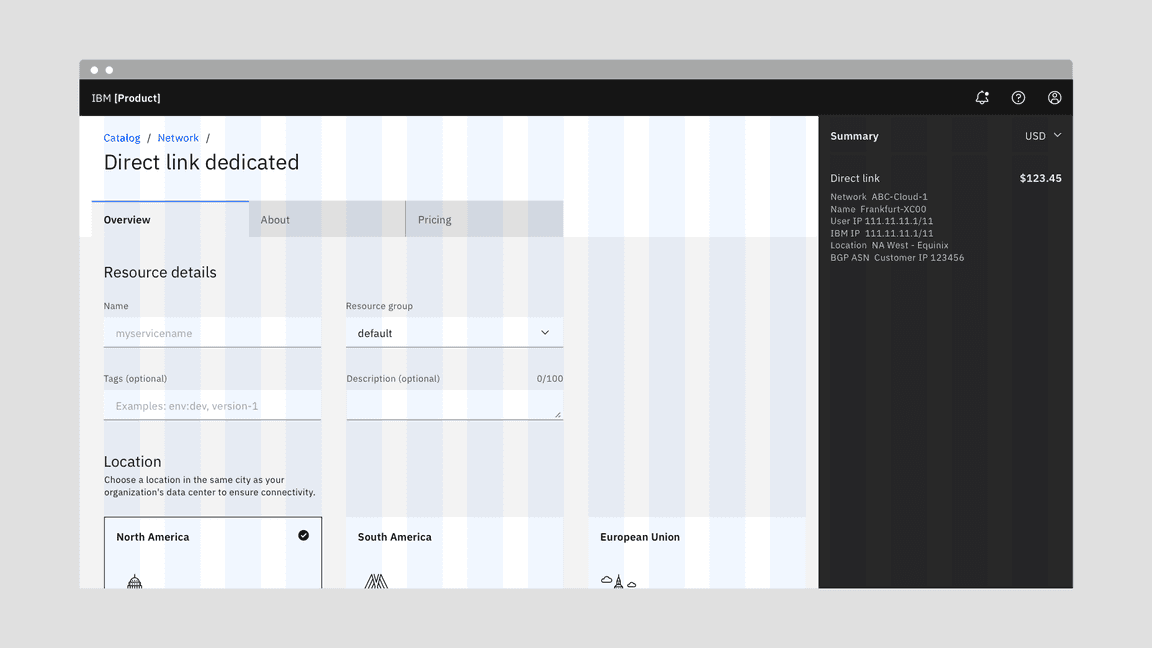
Example of contained tabs using the grid
Alignment within a component
When using line tabs within a component (like a modal) the first label should always align to the other content in the space. Do not use contained tabs. The edges of the line tab may also bleed to the edges of the space if needed depending on the container’s margins. To add hierarchical clarity and balance the tabs with the other content, a line may be added from the end of the last tab to the edge of the content area.
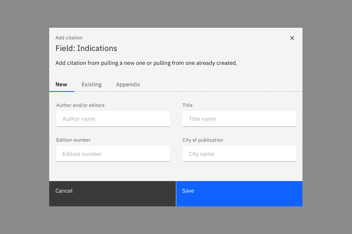
Aligning tabs within a component
Content
Main elements
Labels
- Use short tab labels that are clear and specific. Labels should be one to two words, as these are easier to scan.
- Text labels should clearly communicate the view users will see and the content contained in the view.
Secondary labels
- Contained tabs can have secondary labels to add clarity or assist the user in choosing the right selection.
Further guidance
For further content guidance, see Carbon’s content guidelines.
Behaviors
States
Tabs allow for three states: selected, unselected, and disabled. The default view is that one tab is preselected and is usually the first tab. Only one tab can be selected at a time. When a user chooses a new item, the previous tab is automatically deselected. If a user navigates away from a tab, a user should return to the last tab selected.
For detailed visual information about the various states for this component, see the Style tab.
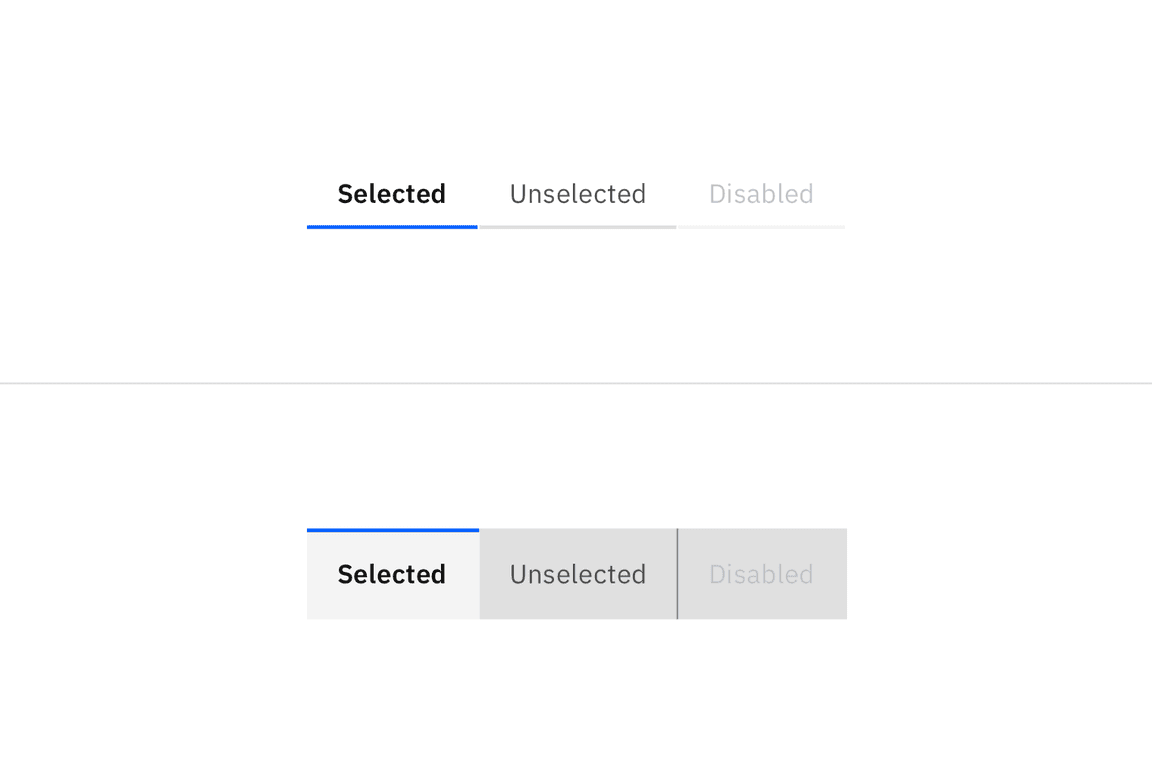
Example of selected, unselected, and disabled states in line tabs (top) and contained tabs (bottom)
Scrollable
When your page requires more tabs that can fit or needs to adapt to a new browser size, tabs should become scrollable. Left and right arrows appear to help navigate the user through tabs that might be off-page.
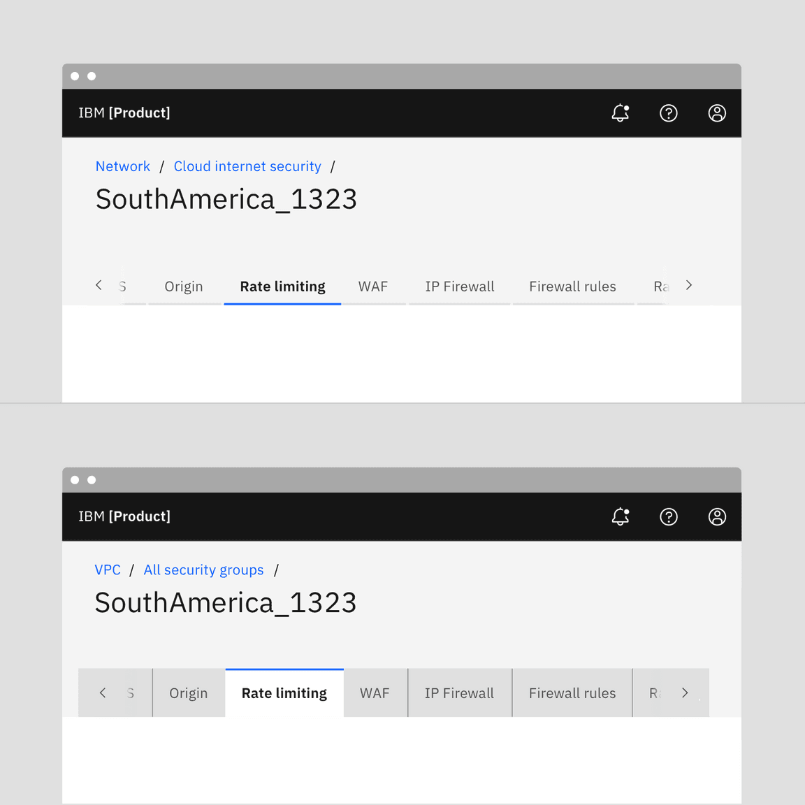
Example of scrolling in line tabs (top) and contained tabs (bottom)
Interactions
Mouse
Users can trigger a state change by clicking anywhere in the container area.
Keyboard
One tab should be selected by default. Users can navigate between tabs by pressing right or left arrow keys. For additional keyboard interactions, see the Accessibility tab.
Screenreader
VoiceOver: Users can navigate between tabs by pressing right or left arrow
keys.
JAWS: Users can navigate between tabs by pressing right or left arrow keys.
NVDA: Users can navigate between tabs by pressing right or left arrow keys.
For additional information, see the Accessibility tab.
Modifiers
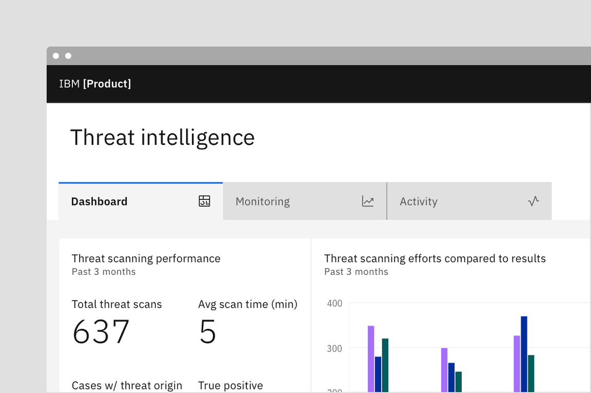
Tabs with icons
You may use icons in either line or contained tabs. Icons are always pinned to the right of the tab and do not appear above, below, or to the left of the label.
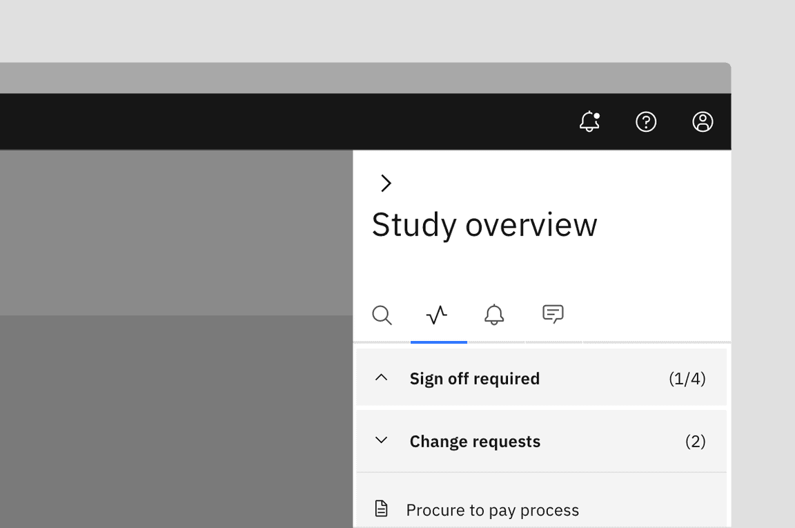
Icon-only tabs
You may use icon-only tabs with both line and contained tabs. Icons must be easily recognized and globally accepted. These work best in small, defined spaces and in components. Always use a tooltip for an icon description on hover to add clarity.
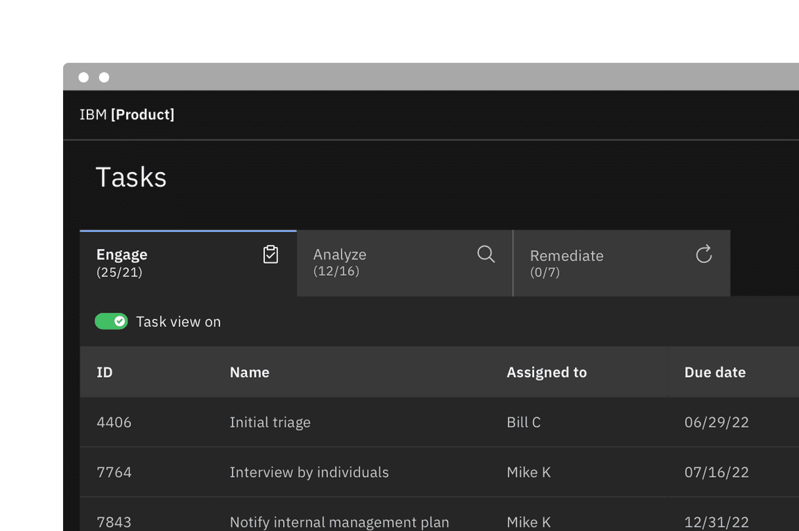
Secondary labels
Contained tabs that align with the grid allow for a secondary label. Do not use secondary labels with line tabs or auto-width contained tabs.
Dismissible tabs
Dismissible tabs allow users to close tabs providing a focused and relevant experience. Users can add or remove tabs as needed, accommodating future content additions or modifications without drastically changing the overall layout or structure.
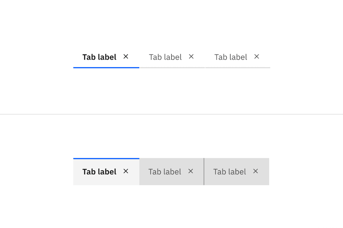
Example of dismissible line tabs (top) and dismissible contained tabs (bottom)
When to use
- Use dismissible tabs to offer flexibility and scalability in complex interfaces that require users to create multiple sections or modules.
- Use dismissible tabs for content created or curated by the user.
- Use to focus a specific data set or search results.
When not to use
- Do not use when tabs contain frequently used or critical information.
- Do not use as navigation.
Dismissible tabs with icons
Carbon provides an option to include icons within the dismissible tabs. Only use icons within dismissible tabs if all tabs will include icons. Do not mix dismisible tabs without icons with dismissible tabs with icons.
Dismissing a tab
When dismissing a tab, an inline warning or modal may be used when information contained in a tab will no longer be accessible or difficult to retrieve. Since warnings, especially modals, are highly disruptive, only use when the dismissal causes errors, unintentional deletions, or unsaved changes.
Triggering a new tab
There are various ways to trigger a new tab. The trigger button can visually change its shape and size depending on the use case. Keep the trigger close enough to the new tab to associate the add action with the new tab item. The order of tabs can be ascending or descending depending on use case but do keep them in a sequential, logical order.
If all tabs are dismissible, make sure a user understands how to trigger new tabs once the tabs are gone. Provide visual cues, such as a container or placeholder tab, so the user clearly understands that the trigger button is creating a new tab in a place they expect.
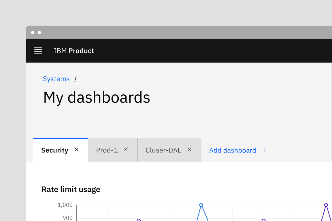
Example of dismissible tabs within a UI utilizing a button to add a tab
Related
Content switcher versus tabs
Content switchers allow users to compare and toggle between alternate views of similar or related content. Content that is grouped into tabs is part of the same bigger context but the content does not overlap.
Navigation versus tabs
Tabs should not be used for common navigation patterns. If your tab arrangements are becoming too complex with different levels of content, consider using left or right UI panels, possibly in conjunction with breadcrumbs, to help the user through the content.
Progress indicator versus tabs
Progress indicator content moves in a logical progression, showing next steps to guide the user through the completion of a task. Tabs organize content into groups that the user can navigate through; they do not support progressive tasks.
References
Jakob Nielson, Tabs, Used Right (Nielsen Norman Group, 2016)
Feedback
Help us improve this component by providing feedback, asking questions, and leaving any other comments on GitHub.